Annalise
AI clinical decision support for radiology, designed so a radiologist could trust it inside a thirty-second read.
00
problem
Radiology is overloaded and under-supplied, and a careless AI makes it worse: a model that flags too much adds noise a tired clinician has to clear. Annalise's model detected well across chest X-ray and CT brain; adoption turned on whether a radiologist would trust its output enough to act on it inside a thirty-second read. That trust layer was my job. I joined as founding product designer, mid-flight: the model had trained for a year, engineering had started, and Covid arrived with me, so I compressed every hospital site visit I could before lockdown. That grew into hundreds of hours observing and testing with hundreds of radiologists internationally.
solution
Competitors showed a region of interest. We showed a per-finding pixel map with a confidence score for every finding type. Clinicians cannot assess an AI they cannot see, and the field was under criticism for opacity. Most AI products hide uncertainty to look confident. We showed the model's probability and the interval around it, so a clinician who could see where the model was unsure kept their own judgement in the loop. We patented that interface.
What the AI was allowed to interrupt for
The model finds a great deal; which findings earn a radiologist's attention is a different question. I argued, with the clinical team, for ranking by clinical consequence rather than model confidence: Priority findings, where being wrong matters most to the patient, and Other findings, incidental to the diagnostic question. Clinical owned which findings landed where. The worklist auto-promoted potentially urgent cases on the same logic.
The findings panel also collapses completely, so a radiologist can finish their own read before seeing what the AI thought, and clinicians in pre-use interviews were adamant they wanted exactly that. In our first MRMC study, about ten radiologists observed across a four-hour shift left the panel open. Stated and revealed preference pointed opposite ways, and the design accommodated a range of reading habits, so it absorbed the difference without rework.
Per-site configurability, argued from research
The FDA's position required separate evidence per finding, so the US ran a subset while Australia ran the full model, up to 130 findings; the product handled the difference through externally loaded configuration, standard engineering practice. My user research, and signal from account managers and customer success, pointed to clinical sites wanting the same control: which findings they saw. I advocated extending that configuration to per-site finding lists, with the Priority and Other grouping layered on top, and took the hypothesis from research and interviews through design, prototyping and testing.
The version with no interface
Where clients accepted the governance risk, findings were rendered into a static image and inserted into their PACS, the clinical record. Clinicians who opened it there often had no access to the app and had never seen it.
That single frame had to do the interface's whole job: the scan, the finding outlines, and enough explanation for someone meeting the output cold, without taxing a clinician reading their hundredth. Every pixel of instruction was a pixel off the diagnostic image. Translation tightened the budget again, because the text was burned into the render and clinical terms run materially longer in some languages. I proposed carrying the findings in DICOM meta-tags alongside the image, which engineering confirmed was feasible, so the finding data travelled with the render and stayed recoverable.
What it bought, and what I can stand behind
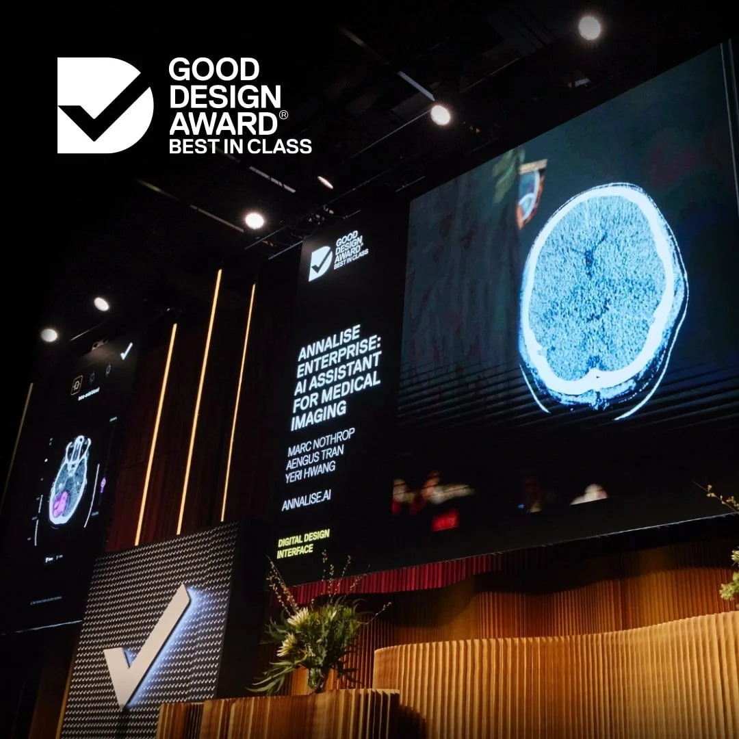
The product went on to process 2.1 million cases across 12,000 facilities worldwide. Harrison's 60-day enterprise evaluations reported 93% of clinicians still using the tool, 73% who would be disappointed to lose it, and a SUS above 80. Those figures are what Harrison's evaluations reported; the underlying research stayed with Harrison. Detection accuracy belongs to the model; what design can claim is that clinicians trusted the output enough to keep using it. The work won an IxDA Interaction Award (Best in Category, shortlisted alongside Google and Philips), Good Design Australia Best in Class, a Good Design Korea award, and an Australian patent. The design system I built carried the product across four product lines.
year
2020–2024
timeframe
4 years
tools
Figma
category
UI/UX
01

02

03

04

05

06

see also

